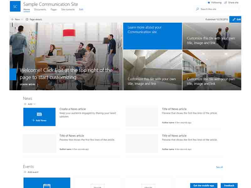
Businesses and organizations communicate with their workers in a variety of ways. To communicate information, many corporations and organizations now use SharePoint communication sites. Communication sites are ideal for aesthetically appealing data presentation as well as disseminating reports, announcements, news, and other information with a big number of people.
What Should I Anticipate From A SharePoint Communication Site?
Sites for communication are responsive, meaning they can be accessed from any device at any time. There's sometimes some misunderstanding about the distinctions between a Team site and a Communication site. Team sites are used to collaborate on content creation with a group of individuals. Within an organization or corporation, communication sites are used to notify others of news, announcements, and reports.
Intranets Benefit From SharePoint Communication Sites
SharePoint communication sites may be an excellent addition to your company's intranet. Because your sites will most likely have a larger audience in this case, it's critical to properly structure your communication sites.
Take the following aspects into account when creating a site for a broad audience:
🟢Ensure that the site complies with your organization's governance guidelines and best practices for site design.
🟢Consider developing a distinct site for the group you're targeting if you have many sorts of communication sites organized by department, function, procedures, or themes.
🟢As the home site will serve as a landing page, make sure it is user-friendly.
What Is The Best Way To Plan A SharePoint Communication Site?
What Is The Best Way To Plan A SharePoint Communication Site?
🟧Consider who you're writing for.
Every communication site is designed to reach out to a certain audience about a given issue or cause. First and foremost, think about who your target audience is. Make a note of the chores they often accomplish, and use our site to assist them.
You may generate material and concepts that make sense to your audience by correctly evaluating your audience. Consider the intended outcomes of the site and how you'll track them. If your target audience speaks more than one language, a multilingual communication site is a good idea.
🟧Plan the content and pages of the website.
Take a deliberate, methodical approach to content creation. Ensure that users can readily access what they'd likely look for using a range of components such as pages, lists, and document libraries. Because pages are simpler to access and examine data than documents, it's a good rule of thumb to have more pages than documents. Because it will be easier to arrange site navigation if you develop your home page last, we recommend doing so.
🟧Make a list and a library.
To present information in an ordered manner, use lists. Using the Lists web element, you can also allow site users to contribute to the page by creating lists. Document libraries are ideal for holding a variety of files and documents.
🟧Decide how you want your pages to be organized.
In addition to the content of the site, the structure of the pages must be planned. To improve the arrangement of a page, for example, you may add columns and build page attributes.
🟧Take into account the governance and accessibility rules.
Prior to finishing the design, photos, videos, and accessibility of your SharePoint communication site, make sure it complies with your organization's governance and accessibility criteria.
🟧Additional SharePoint communication site suggestions
Here are some suggestions for making your pages more user-friendly:
🟢To show relevant material to a specific set of people, utilize the Audience Targeting feature.
🟢Only show high-priority items initially, then provide more information if the user requests it.
🟢Remember that people are visiting the site to complete a job or achieve an aim, so don't give them too much information.
🟢Create categories to help others find what they're looking for.
🟢To split text parts, use the built-in header styles.
🟢Content should be presented in short pieces on your websites.


